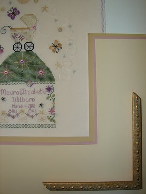
Yesterday I got a mock-up of the baby sampler framing back from Jill. (Wow, super-fast turnaround!)


Here's my thoughts. I absolutely love the mat shape and her painting ideas. BUT....I'm not crazy about the yellow-y mats and the frame. I know she used the deep pink mat to highlight the text, and I like that, but those yellows just don't make me happy. And the frame moulding is one that I've used on at least 2 or 3 other pieces, including Butternut Road's "Once Upon a Time." Don't get me wrong, it is a lovely choice, I just already have it hanging on a couple walls.... Hmmm. Any ideas??

 Here's my thoughts. I absolutely love the mat shape and her painting ideas. BUT....I'm not crazy about the yellow-y mats and the frame. I know she used the deep pink mat to highlight the text, and I like that, but those yellows just don't make me happy. And the frame moulding is one that I've used on at least 2 or 3 other pieces, including Butternut Road's "Once Upon a Time." Don't get me wrong, it is a lovely choice, I just already have it hanging on a couple walls.... Hmmm. Any ideas??


4 comments:
I also assume that the yellow-ish mat would allow for her painting design as shown in the drawing. Perhaps going with a leafy green that is light enough to paint on would work? I'd try to pull the green and the purple as well as the pink if you are not fond of yellow.
Many of my pieces have the same frame. But you really notice the frame less and my decorator friend says that framing different pictures in the same frame adds continuity to a room while allowing for the visual interest of different pieces.
I was going to say ask about green & purple too.
I love the frame but understand your point about not wanting it on everything in your house. I'd just ask her for something similar.
I like the mat and drawing ideas too. The matting and frame choice does look like too much yellow. The first color that came to my mind was a light lavendar as the top mat...I like Medieval Needle's ideas too. She'll need a light color to do her drawing but she used lavendar on my "G" and her drawing looked great. Just tell her you want a couple more mockups(with tips)...she'll be happy to accomodate.
I liked the yellows. They seem like exactly the right colors to pull out of that piece.
Post a Comment